Tilliput – Rebranding & Packaging Design
Problem Observed –
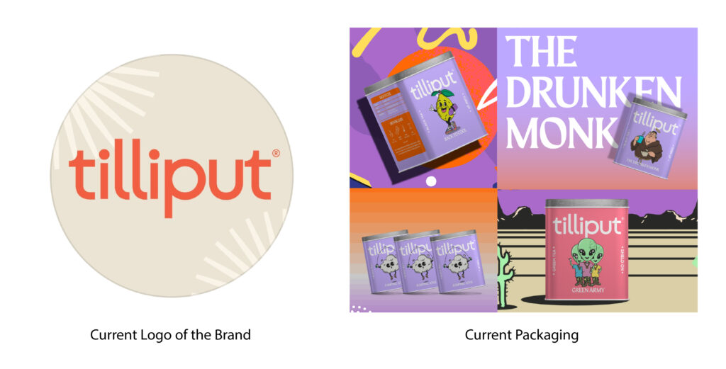
The existing packaging and logo give the product a rather ordinary feel. Even with bold colors, the design and concept fail to make a strong impression. Since the brand primarily targets a young audience, I took on the challenge of redefining its identity. Considering its roots in Darjeeling and its rich cultural essence, I reimagined the brand to better reflect its heritage while making it more visually striking and appealing!
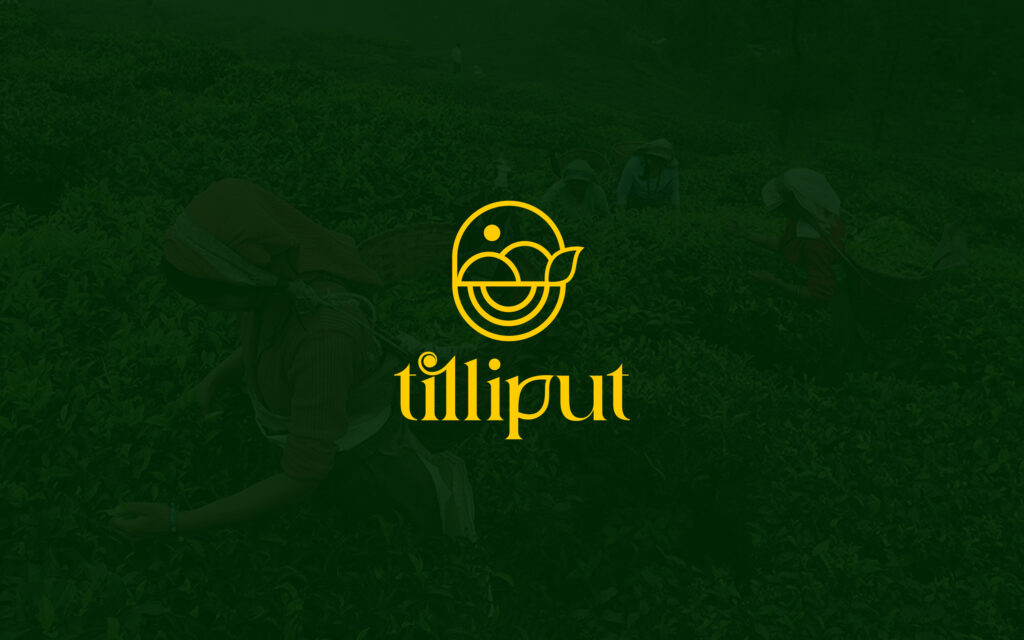
REBRANDING – A NEW WAVE OF DARJEELING TEAS
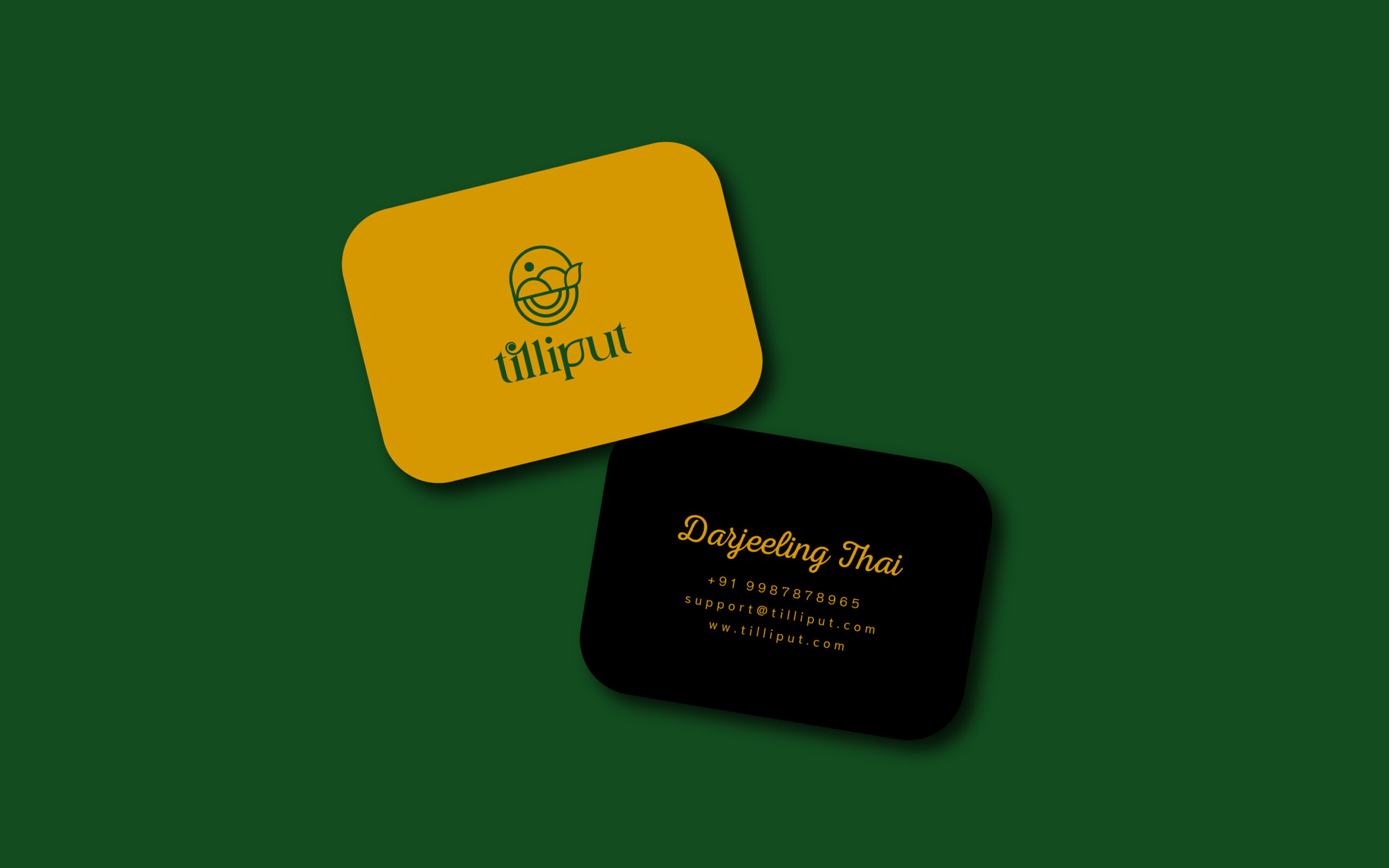
I did the rebranding of a tea brand called “Tilliput”, recognizing that its brand communication had far more potential than its existing design conveyed.
Tilliput is redefining the way young consumers experience tea. As a premium, fresh, and experimental brand, it sources the finest leaves from local tea gardens in Darjeeling, crafting blends that cater to a new generation of tea drinkers-Millennials and Gen-Z.
With a focus on quality, wellness, and innovation, Tilliput offers a diverse range of teas, from bold black teas to refreshing herbal infusions, each designed to complement modern lifestyles, Unlike traditional tea brands, It speaks to those who see tea as more than just a beverage-it’s a ritual, a mood, and an experience. By blending heritage with contemporary tastes, It is making Darjeeling teas accessible, stylish, and exciting for today’s health-conscious and trend-savvy consumers. It is bringing a fresh perspective to the world of tea.
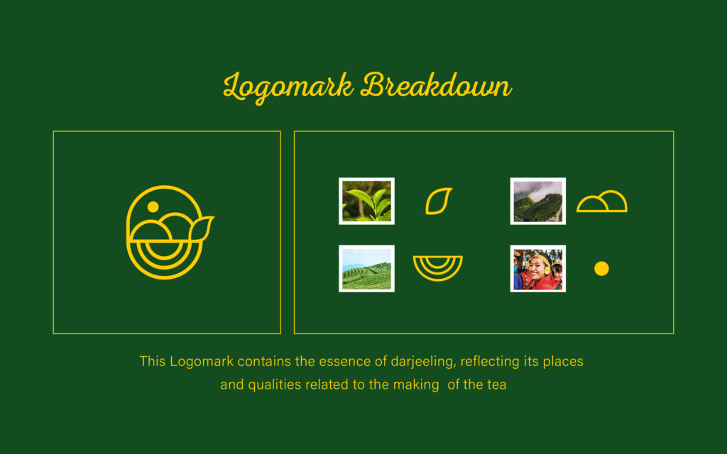
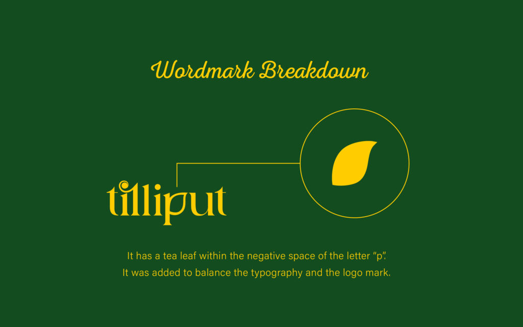
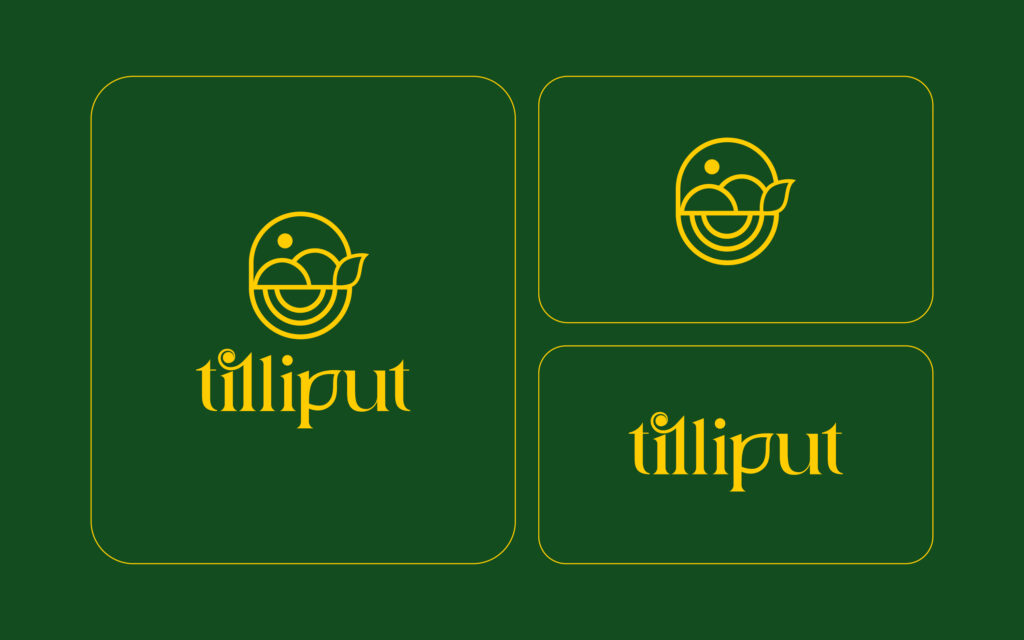
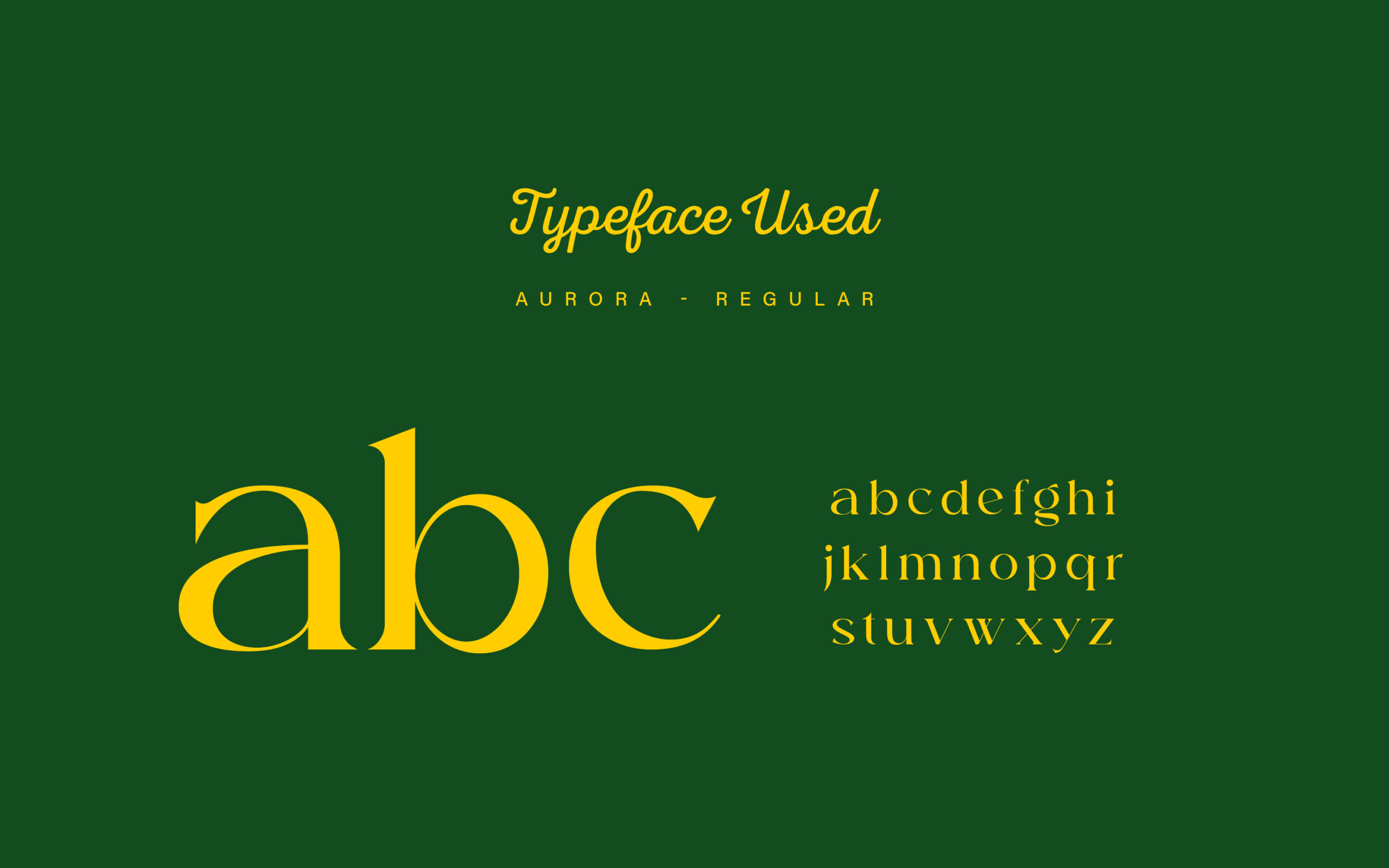
Logo Redesign
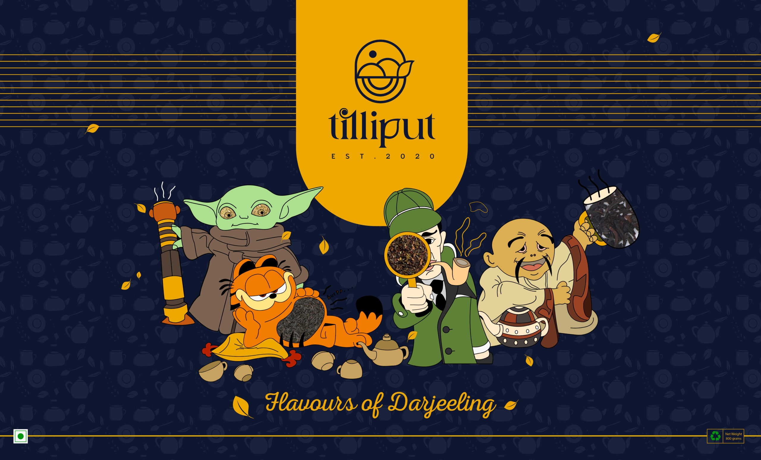
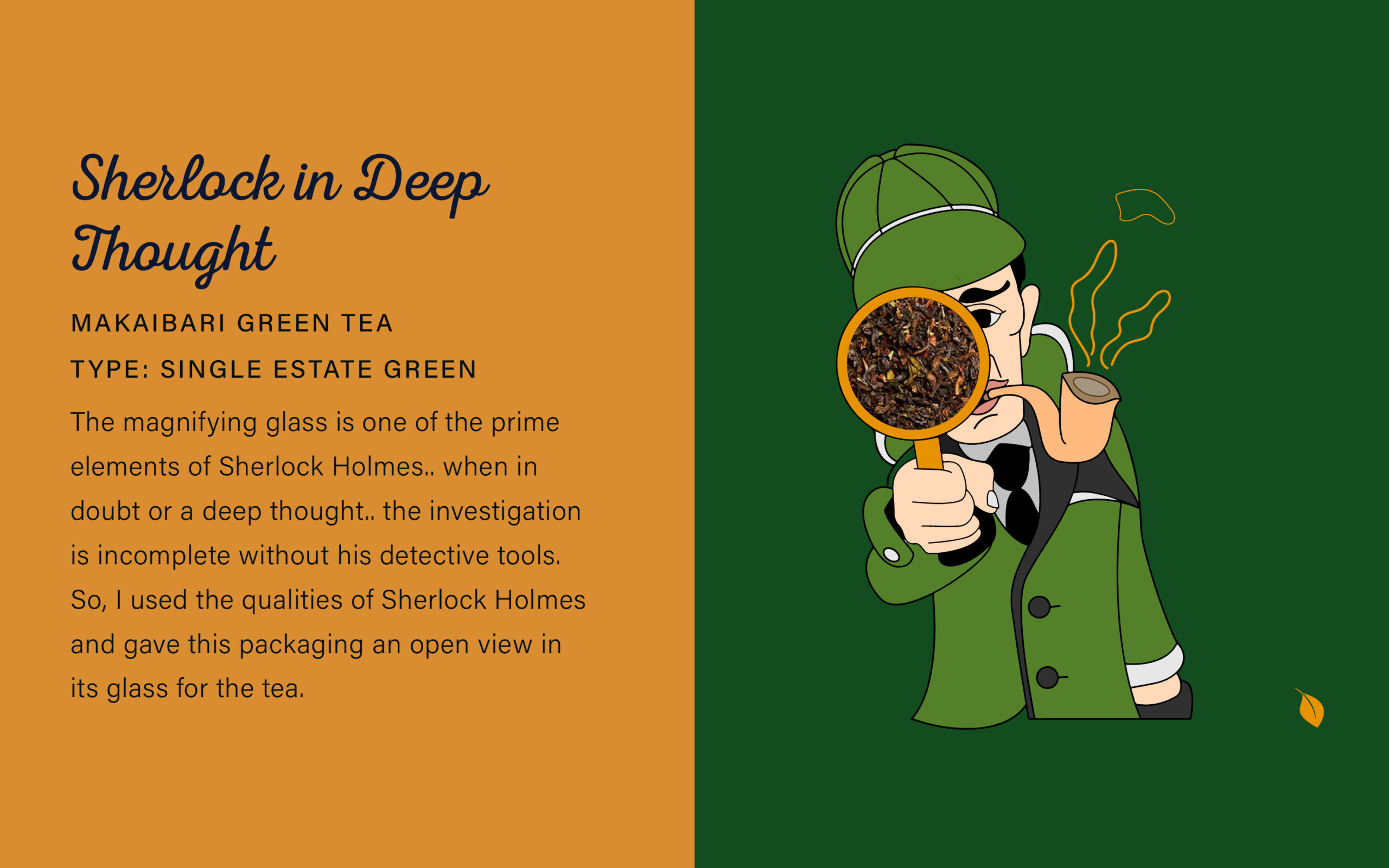
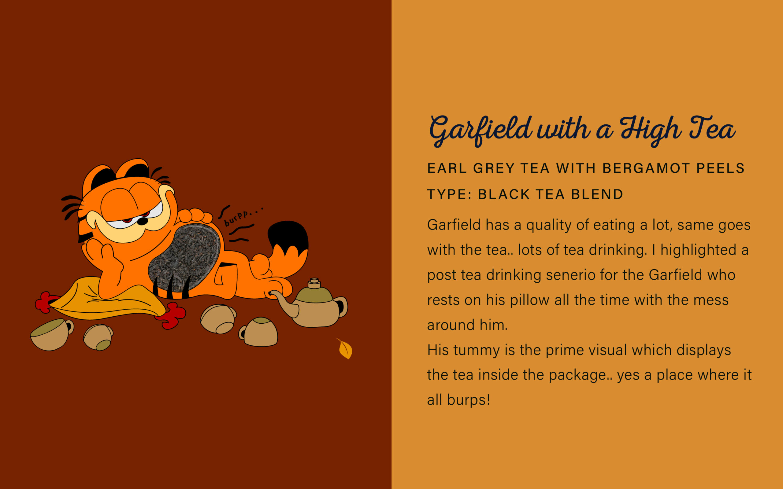
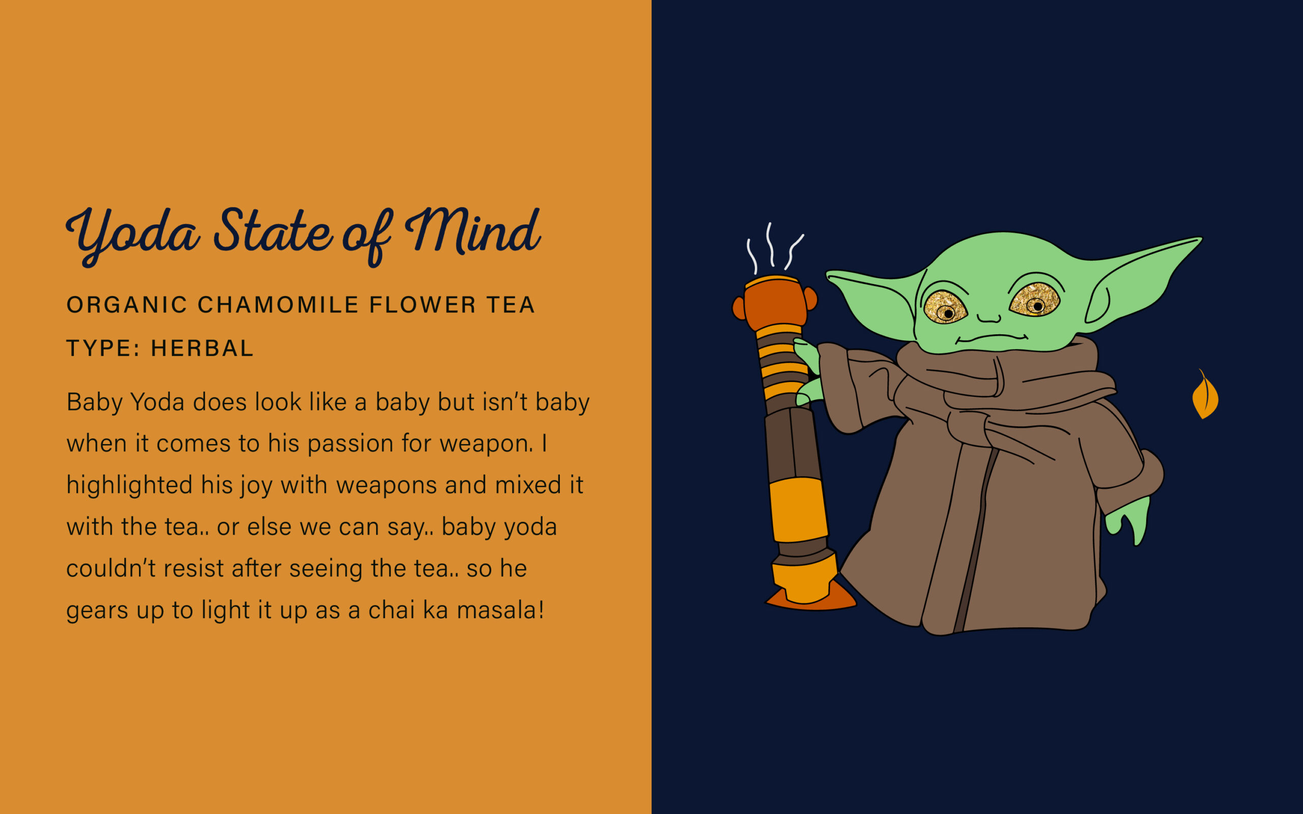
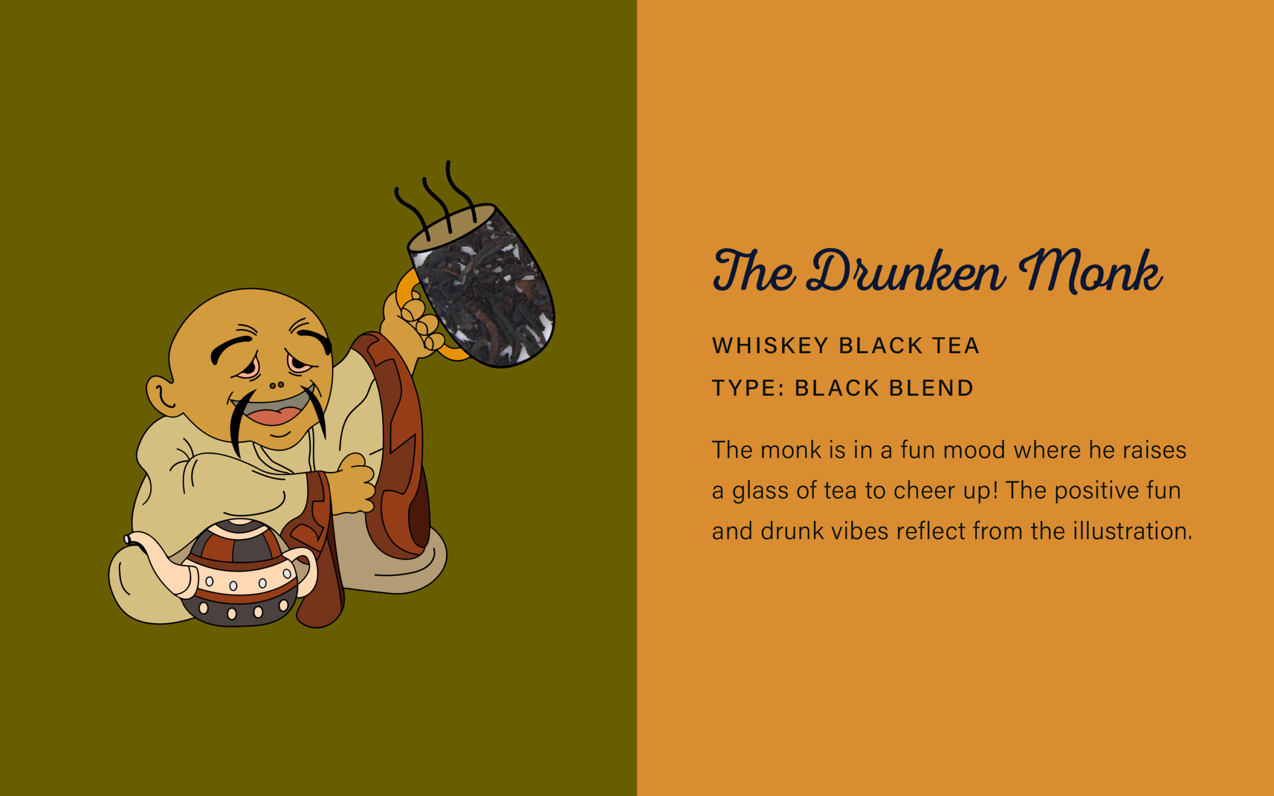
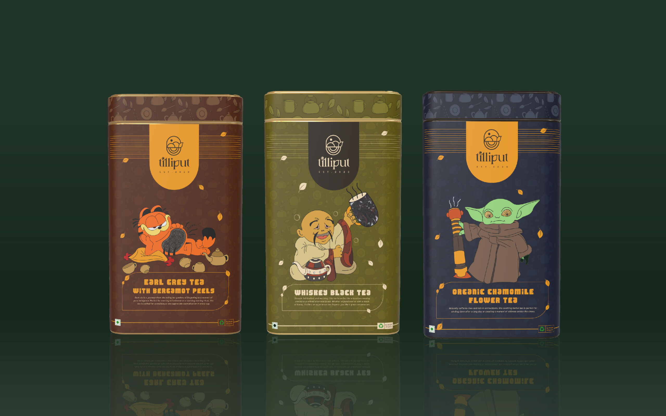
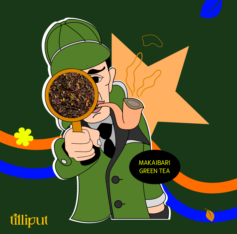
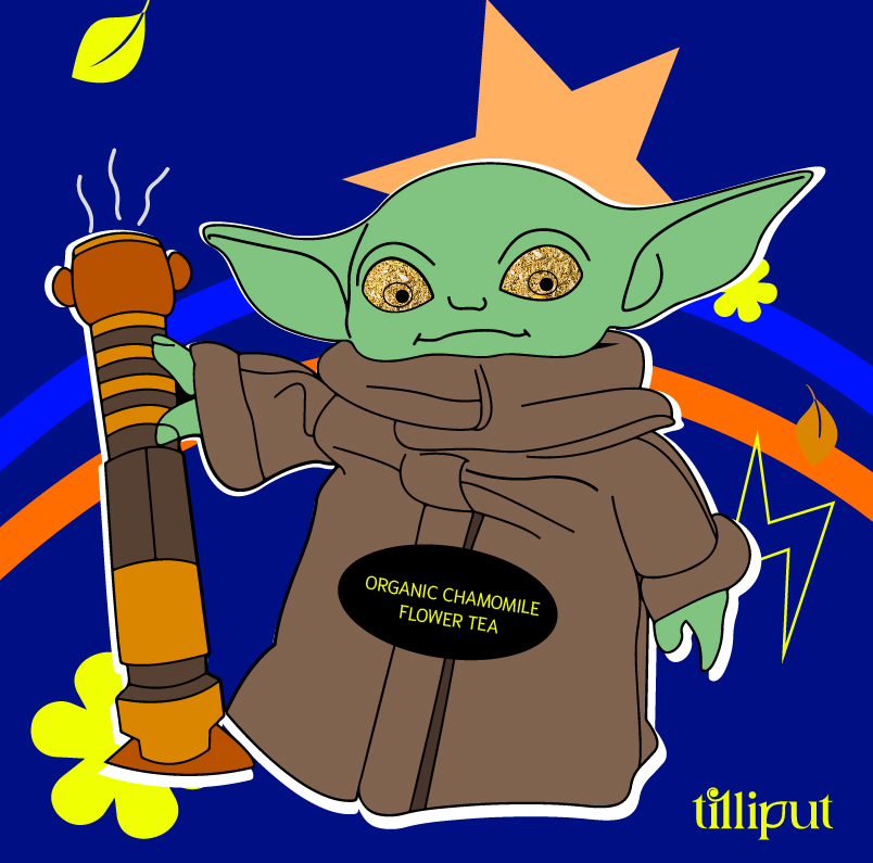
Theme and Characters Designed
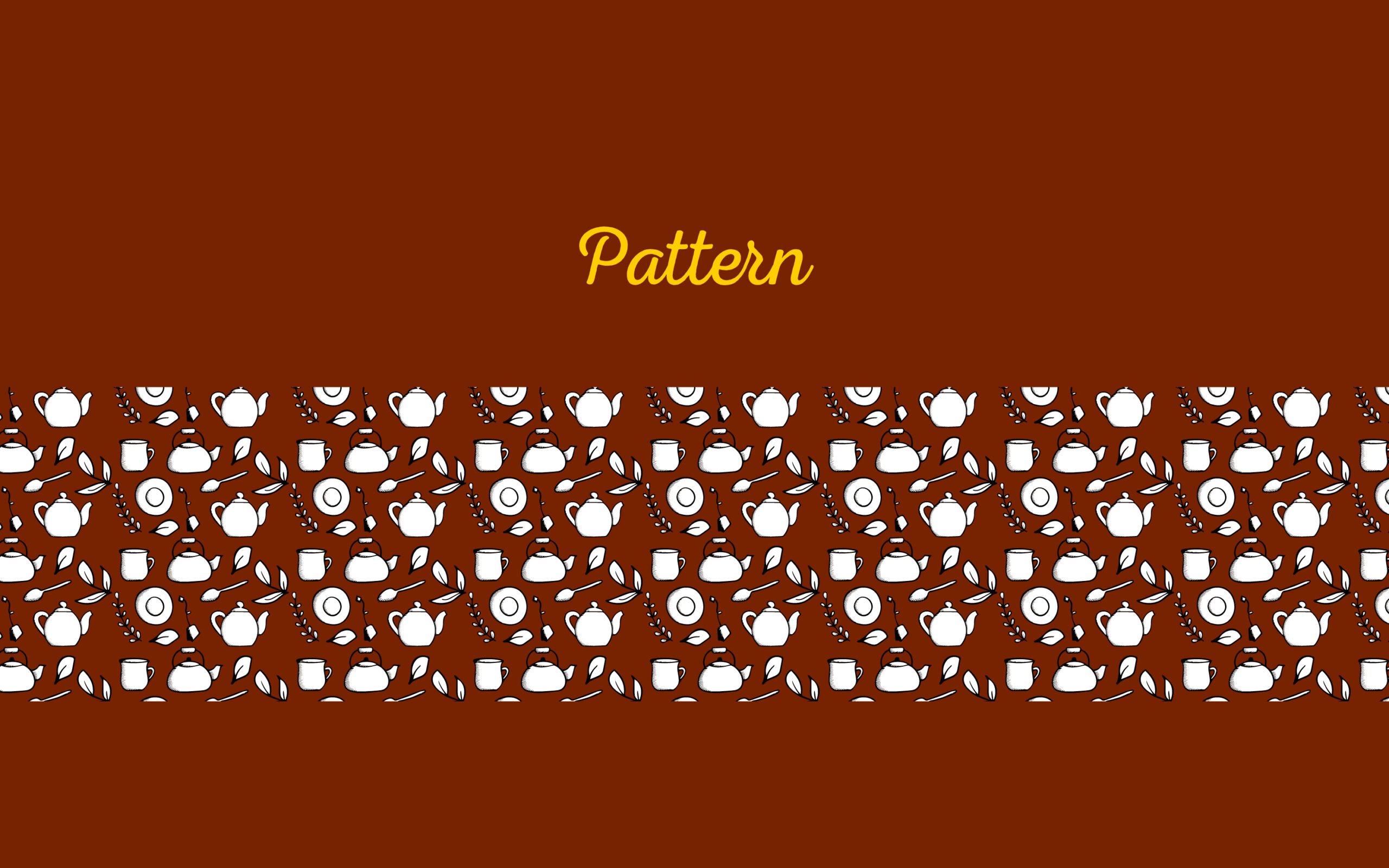
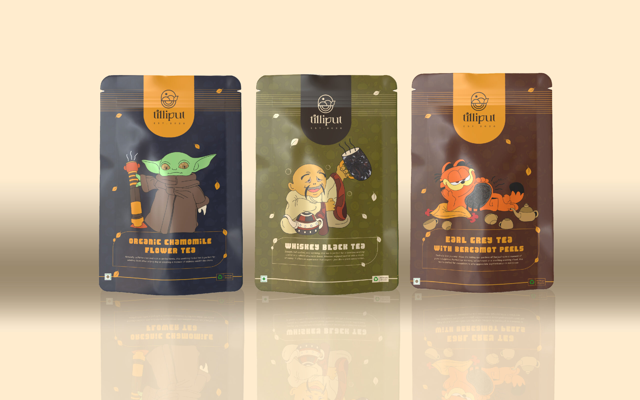
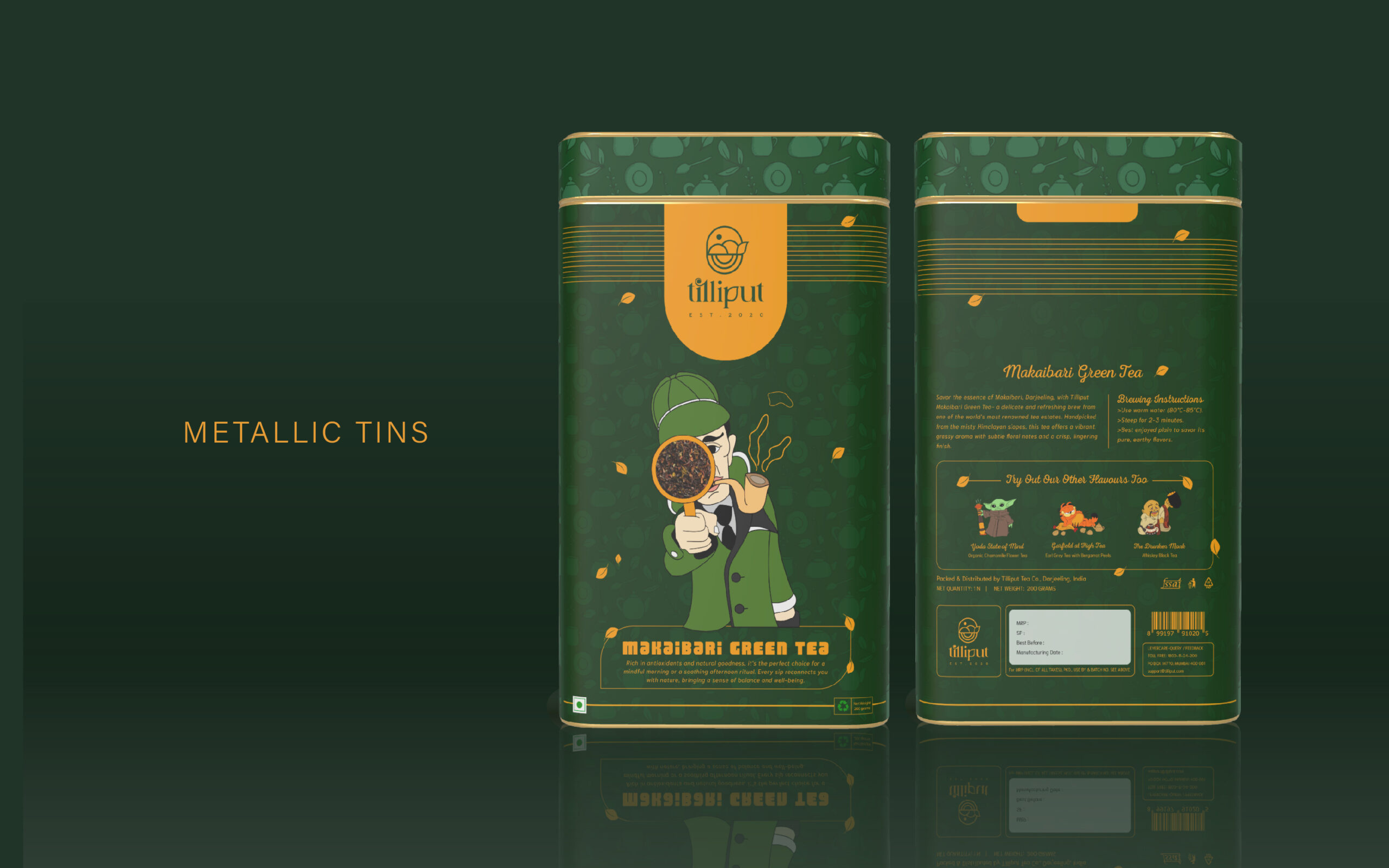
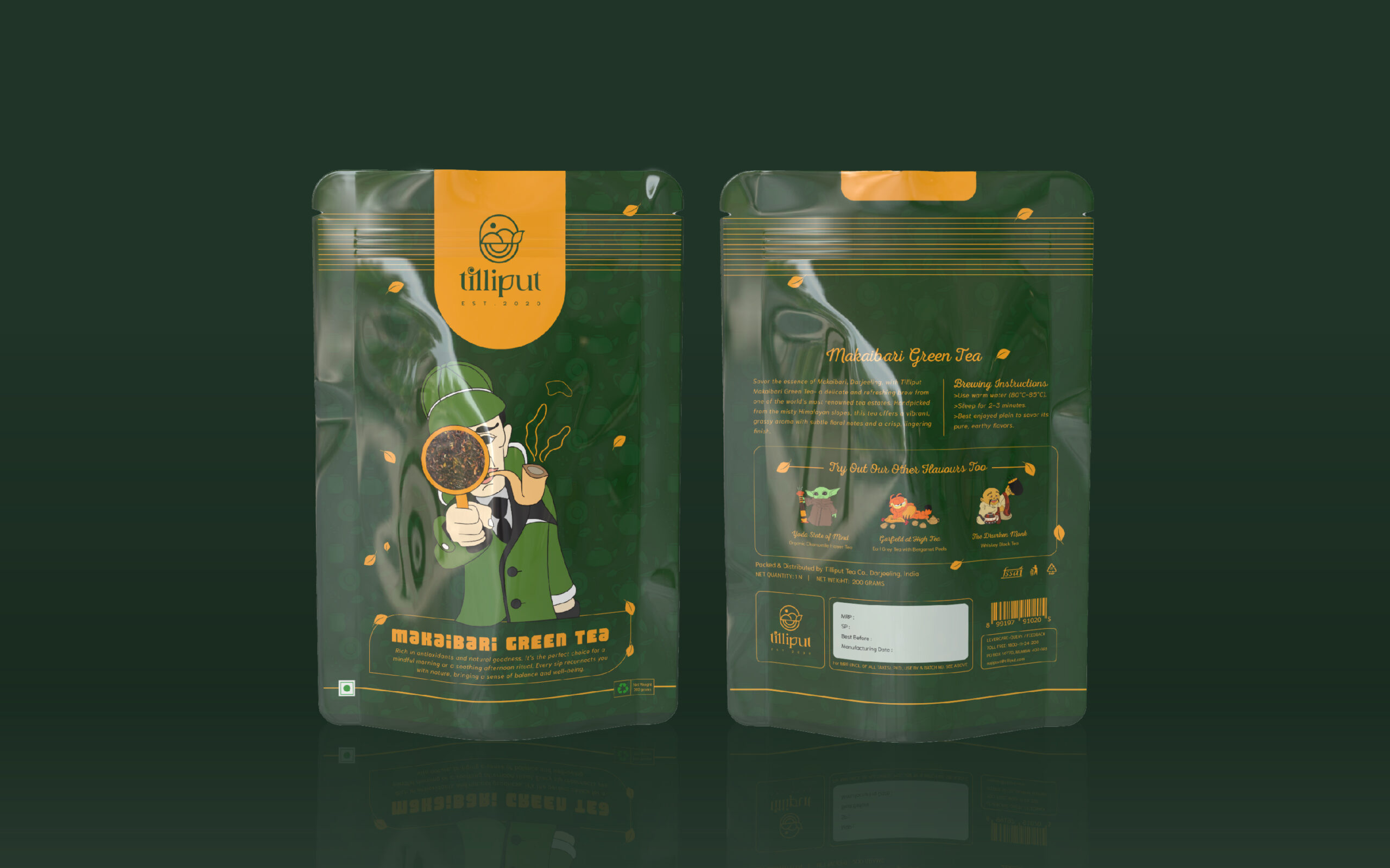
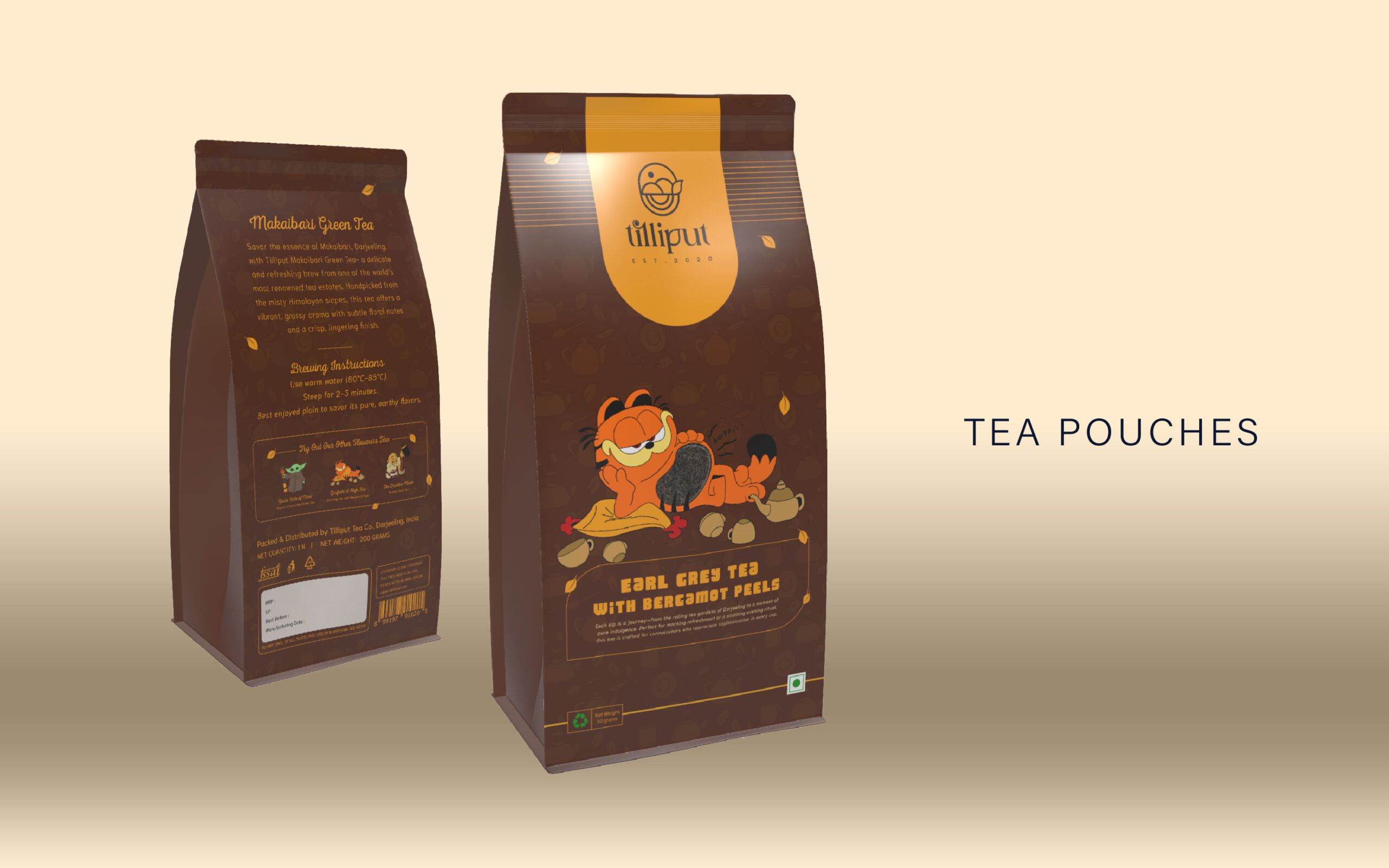
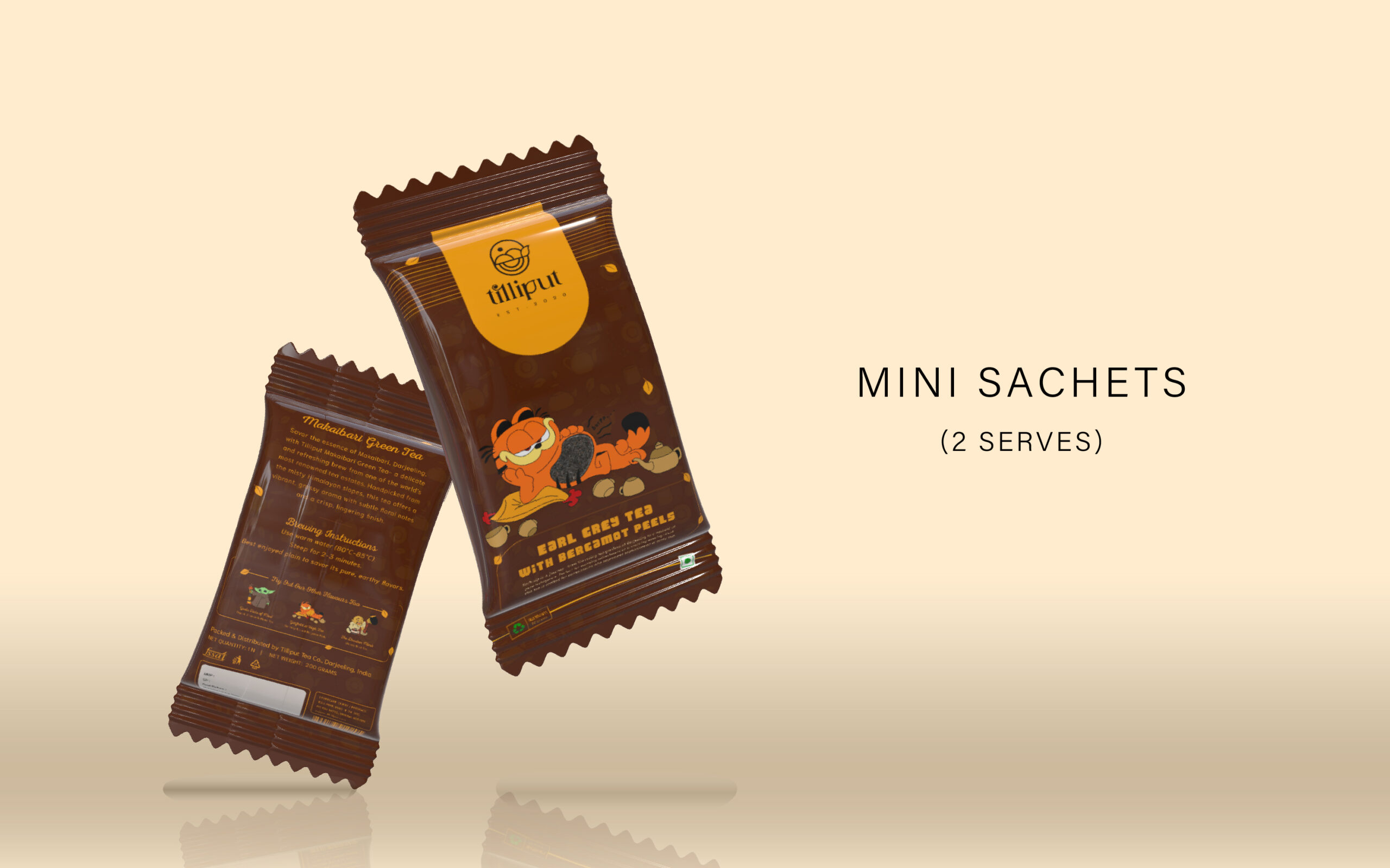
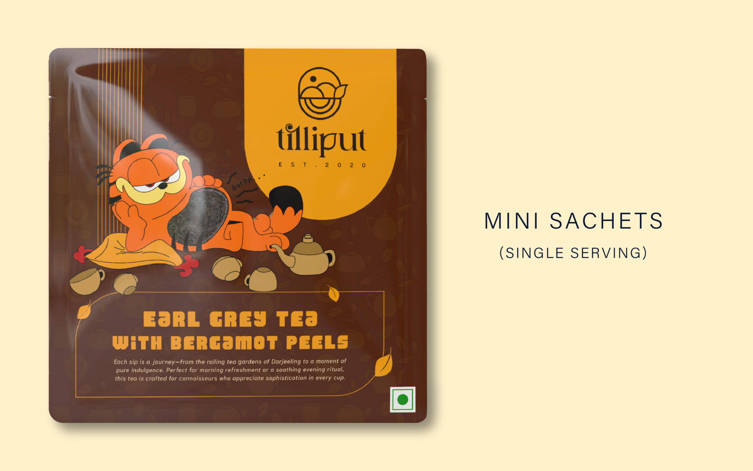
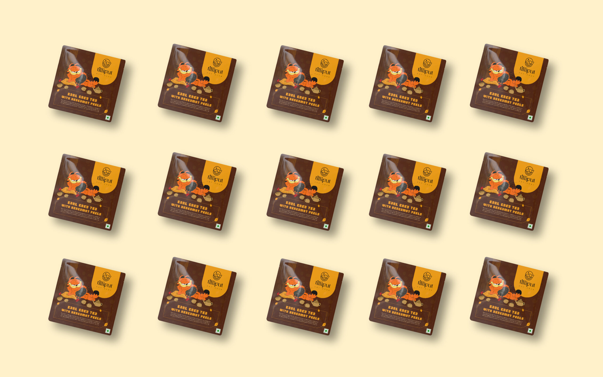
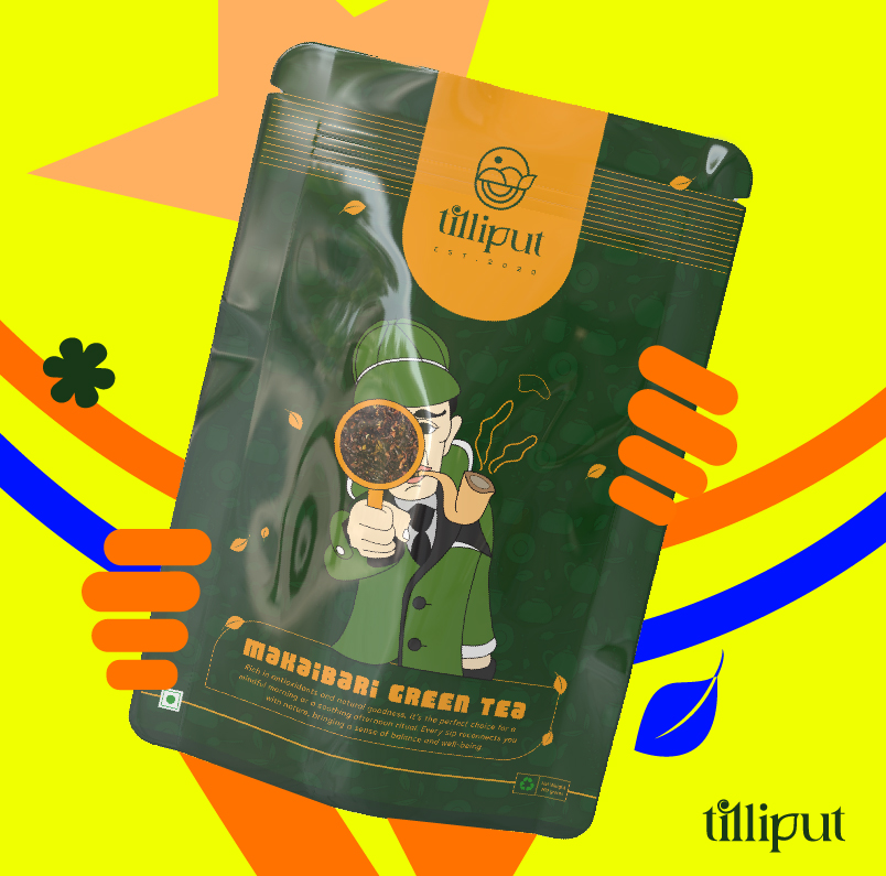
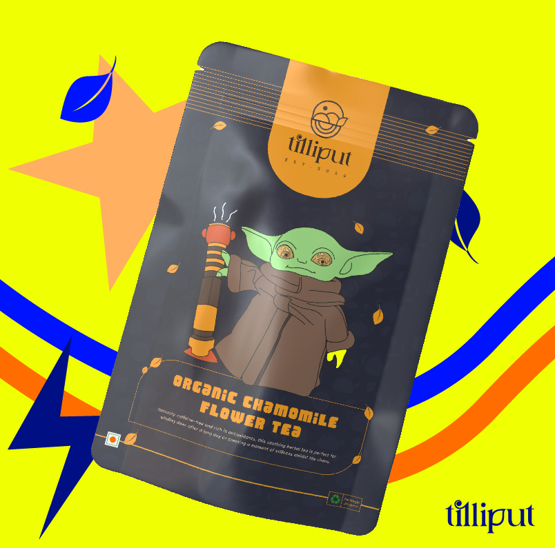
Packaging Redesign
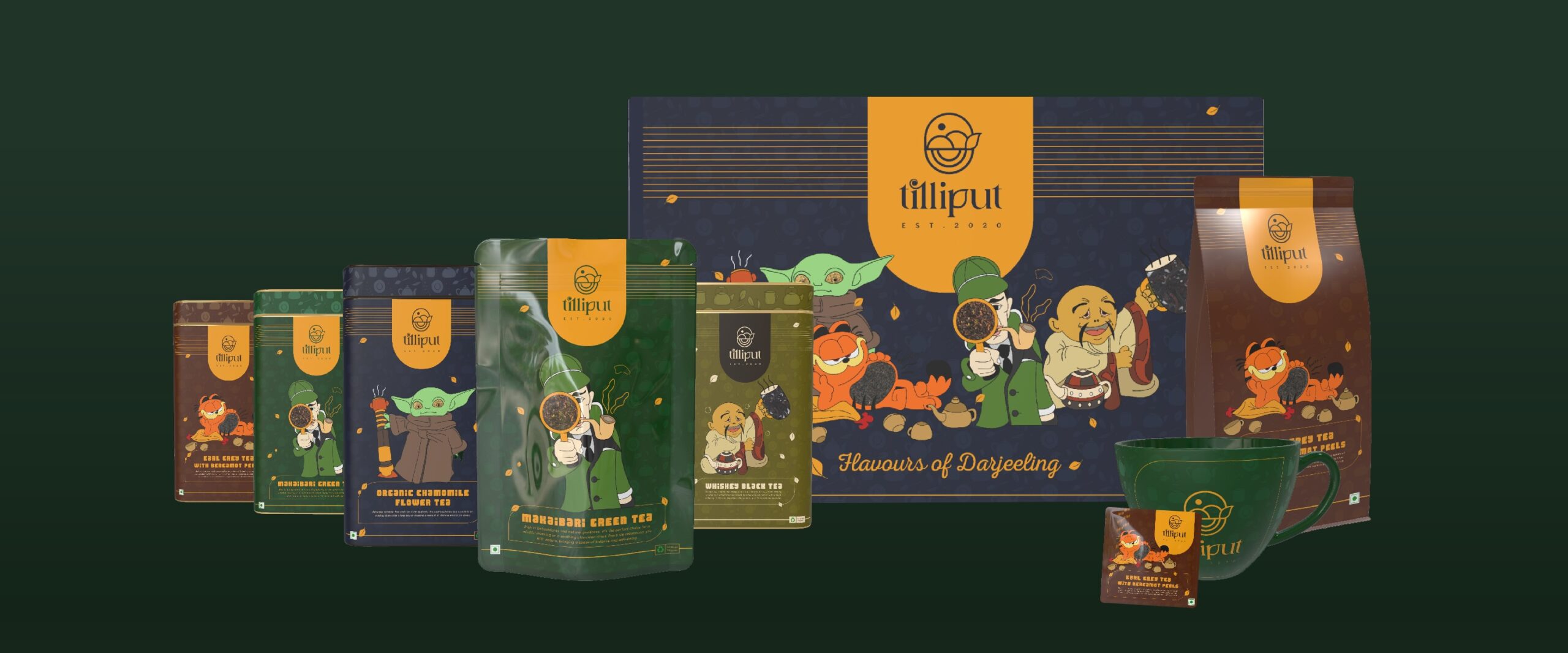
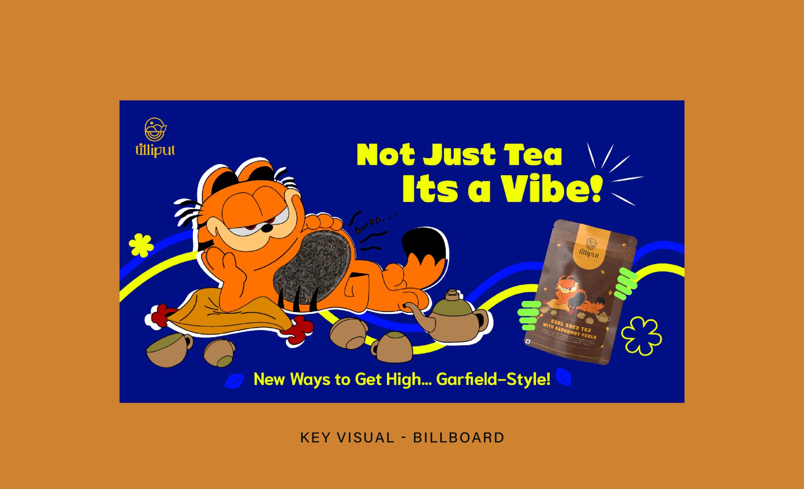
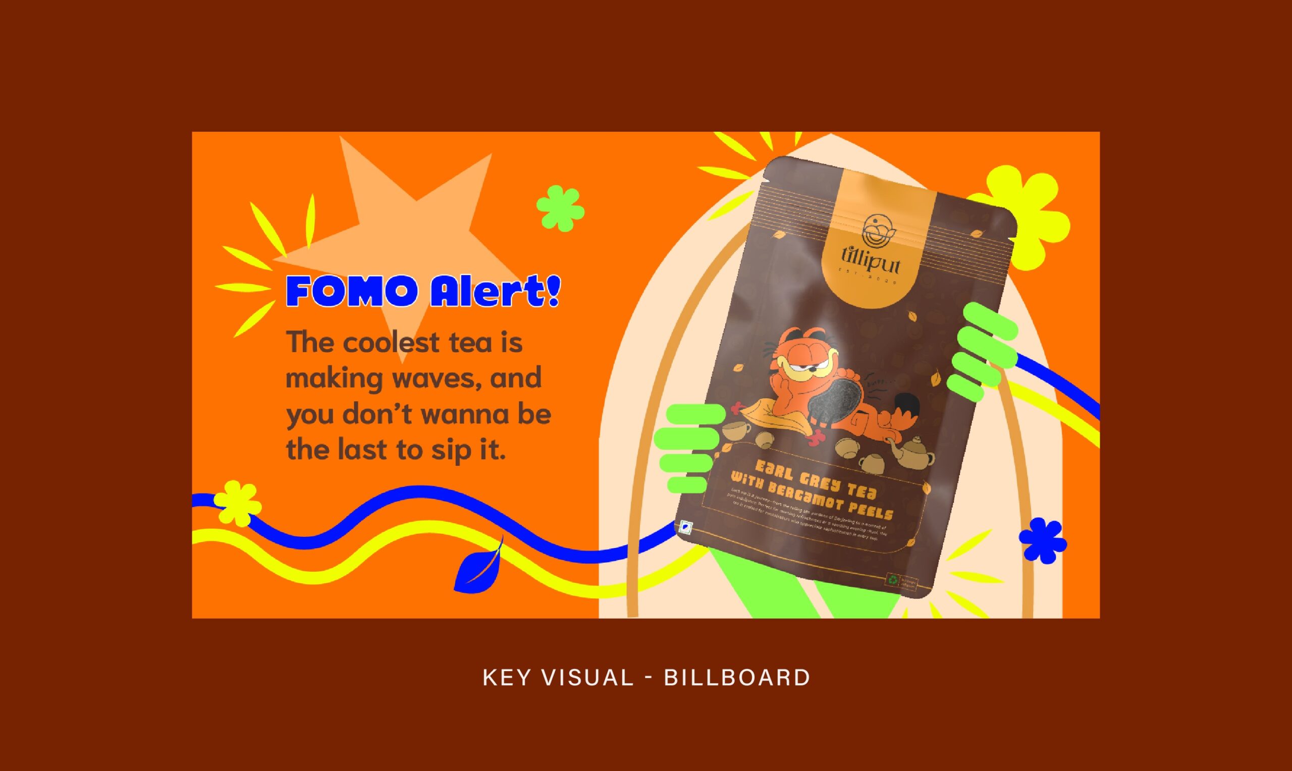
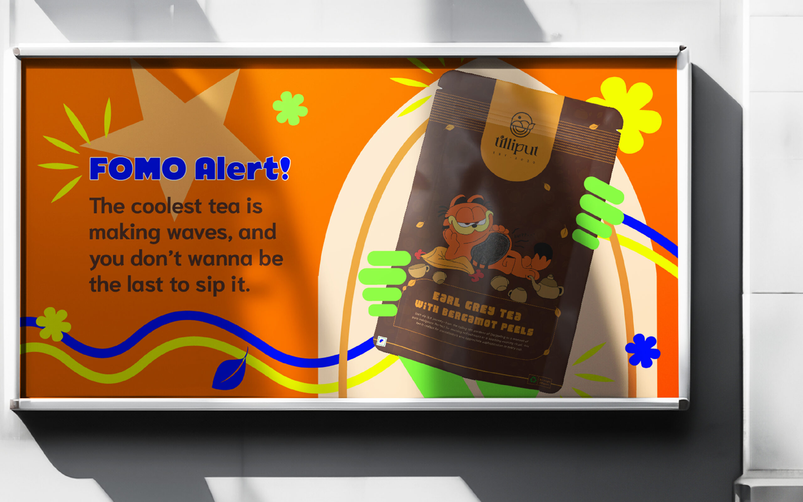
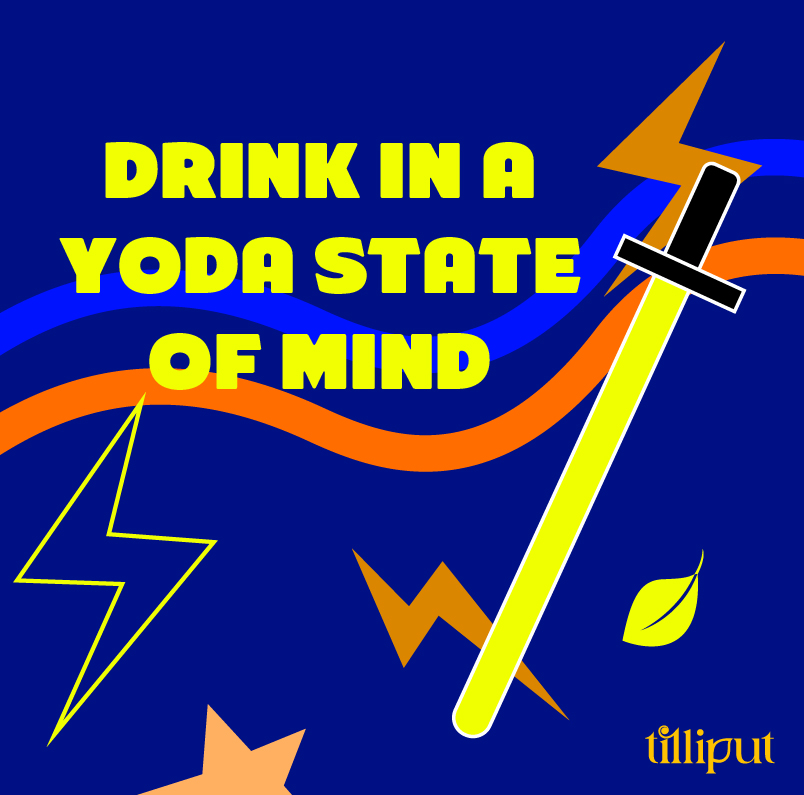
Promotional Material


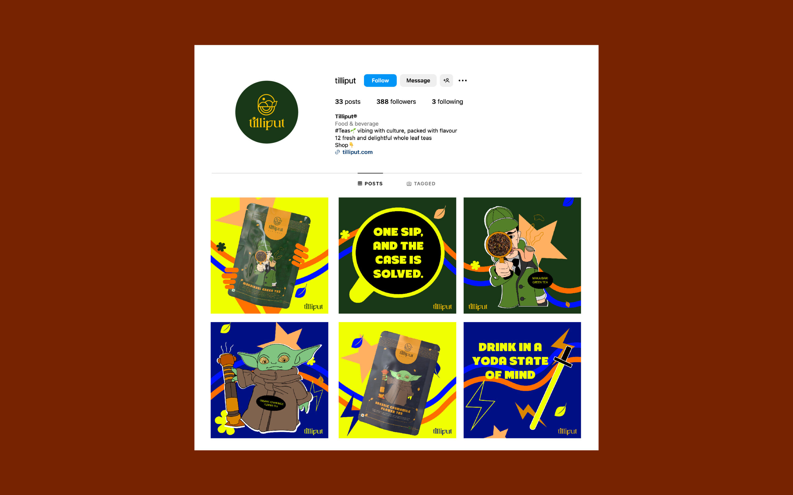
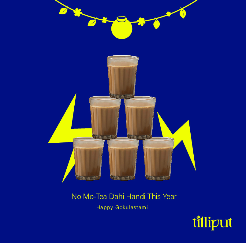
Festive and Days Posts